We’re constantly working to improve your user experience in the Azure portal. Our goal is to offer you a productive and easy-to-use single-pane-of glass where you can build, manage, and monitor your Azure services, applications, and infrastructure. In this post, I’d like to share the highlights of our latest experience improvements, including:
◉ Improved portal home experience: increased focus and clarity to bring services and instances that are relevant to you front and center.
◉ New service cards: new service hovercards that present contextual information relevant to each service.
◉ Enhanced service browsing experience: simplified offering navigation by progressively disclosing services.
◉ Extended Microsoft Learn integration: contextual integration of free training in key parts of the experience.
◉ Improved instance browsing experience: updated experience for more than 70 services with improved performance, better filtering and sorting options, grouping, and to allow exporting your resource lists to a CSV file.
◉ Improved Azure Resource Graph experience: re-use and share your queries via Resource Graph Saved Queries.
◉ Automatic refresh in Azure Dashboard: set automatic refresh intervals for your dashboard.
Improved service icons: New icons re-designed for better visual consistency and reduced distractions.
◉ Simplified settings panel: better separation between general settings and localization.
◉ New landing page for Azure Mobile application: added a new landing page that brings important information.
We have improved the Azure portal home page to increase focus and clarity and to make things that are important to you easily accessible.
◉ Improved portal home experience: increased focus and clarity to bring services and instances that are relevant to you front and center.
◉ New service cards: new service hovercards that present contextual information relevant to each service.
◉ Enhanced service browsing experience: simplified offering navigation by progressively disclosing services.
◉ Extended Microsoft Learn integration: contextual integration of free training in key parts of the experience.
◉ Improved instance browsing experience: updated experience for more than 70 services with improved performance, better filtering and sorting options, grouping, and to allow exporting your resource lists to a CSV file.
◉ Improved Azure Resource Graph experience: re-use and share your queries via Resource Graph Saved Queries.
◉ Automatic refresh in Azure Dashboard: set automatic refresh intervals for your dashboard.
Improved service icons: New icons re-designed for better visual consistency and reduced distractions.
◉ Simplified settings panel: better separation between general settings and localization.
◉ New landing page for Azure Mobile application: added a new landing page that brings important information.
Improved portal home experience
We have improved the Azure portal home page to increase focus and clarity and to make things that are important to you easily accessible.
Figure 1 – simplified Azure portal home.
We’ve organized these into differentiated sections for ease of use:
◉ Services and resources (dynamic): the top section has dynamic content that gets adjusted based on your usage without requiring any additional customizations. The more you use the portal, the more it adjusts to you!
◉ Common entry points and useful info (static): the lower section contains static content with common entry points to provide quick access to main navigation flows that are always there, enabling users to develop muscle memory for repeated usage.
Figure 2 – sections of the home page.
The Azure services section provides quick access to the Azure Marketplace, a list of eight of the most-used Azure services, and access to browse the entire Azure offering. The list of services is populated by default with some of our most popular services and gets automatically updated with your most recently used services. The Recent resources section shows a list of your recently used resources. Both lists get updated as you use the product. Our goal is to bring relevant services and instances front and center without requiring customization. The more you use the product, the more useful it gets for you! The rest of the sections are static, providing important points of reference for navigation and access to key Azure products, services, content, and training.
The overall home experience has been streamlined by hiding the left navigation bar under an always present menu button in the top navigation bar:
Figure 3 – The menu button
The main motivation for this change is improving focus, reducing distractions and redundancy, and to enable more immersive experiences. Before this change, when you were immersed in a workload in the portal you always had two vertical menus side by side, the left navigation bar and the menu for the experience. The left navigation bar is still available with all its functionality, including favorites, through the menu button at the top bar, always only one click away.
Figure 4 – The new experience allows for more focus.
If you prefer the old visual, having the left navigation always present, you can always bring it back using the Portal Settings panel.
New service cards
We have added hover cards associated with each service that show contextual information and provide direct access to some of the most common workflows. These hover cards are displayed after the cursor is placed for about a second on a service tile. We used the same interaction pattern and design than Outlook uses for identities (users and groups) that are well established with our customer base.
Figure 5 – hover card for virtual machines.
The cards expose relevant contextual information and actions for a service, including:
◉ Create an instance: this provides quick access to a very common flow, short circuiting going though intermediate screens to launch the creation.
◉ Browse instances: browse the full list of instances of that service.
◉ Recently used: the last three recently used instances of that service, providing direct contextual access.
◉ Microsoft Learn content: specialized free training curated for that service. The curation has been done by the Microsoft Learn team based on usage data and customer feedback.
◉ Links to documents: key documents to learn or use the product (quick starts, technical docs, pricing.)
◉ Free offerings available: if the service has free options available, surface them.
Figure 6 – Anatomy of the card
The cards help improve on multiple aspects including more efficient customer journeys, better discoverability, and contextualized information, all presented in the context of one service. The card also helps customers of all levels of expertise: While new customers can benefit from Microsoft Learn content and free offerings advanced customers have a faster path the create instances or access their recently used instances of that service.
The card does not only show on the home page. It is available in every place we display a service like the left navigation bar, the all services list, as well as the Azure home page.
Extended Microsoft Learn integration
Microsoft Learn provides official high-quality free learning material for Microsoft technologies. In this portal update we have introduced several contextual integration points:
◉ Service browsing: contextual integration at the service category level (compute, storage, web, etc.)
◉ Service cards: contextual integration at the service level (virtual machine, Cosmos DB, etc.) available in Azure home page, left navigation, and service browsing experience.
◉ Azure QuickStart center: integration of most popular trainings in the landing page
◉ Azure home: direct access to the main Microsoft Learn entry point
Moving forward, the Azure portal and Microsoft Learn integration will continue to grow, to help you improve your Azure journey!
Enhanced service browsing experience
Azure is big and gets bigger every day. Navigating through Azure’s offering in the portal can be intimidating and challenging due to the vast set of available services. To make this easier, we’ve made the following updates:
◉ Improved global search: improved performance and functionality when searching for services in the global search box in the top bar of the portal. This improved search is also always present and available in your portal session.
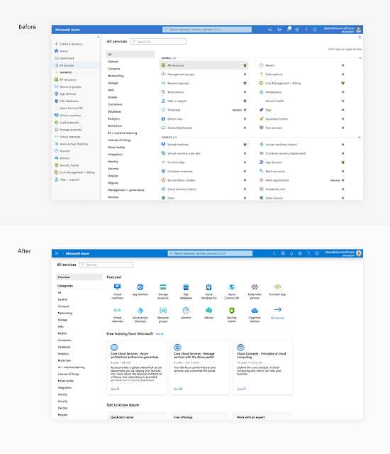
◉ Improved service browsing experience: improved the All services experience adding an overview category supporting progressive disclosure of services, reducing visual clutter, and adding contextual Microsoft Learn content.
For service browsing, we introduced an overview category with the goal of progressively disclosing information.
Figure 7 – progressive disclosure of information and better discoverability
The new Overview category presents a list of 15 of Azure’s most popular services, curated Microsoft Learn training content, and access to key functionality like Azure QuickStart center and free offerings.
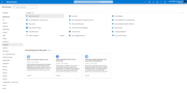
If the service that you are looking for is not available on this screen you can use the service search functionality, at the top left, or you can browse through the different categories available, at the left of the screen. When displaying a category, we are now surfacing contextual and free Microsoft Learn content to assist you in your Azure learning journey.
Figure 8 – service category with contextual and free Microsoft Learn integration. The training offered in this category is contextual and related to databases in this case.
Improved instance browsing experience
The resource instances browsing experience, going through the list of instances and services is one of the most common entry points for customers using the portal. We are introducing an updated experience that leverages the power of Azure Resource Graph to provide improved performance, better filtering and sorting options, better grouping, and allows exporting your resource lists to a CSV file.
Figure 9 – improved resource browsing experience
As of this month, this experience will be available for more than 70 services and over the next few months it will be rolled out across the entire platform.
Improved Azure Resource Graph experience
The Azure Resource Graph Explorer available in the portal enables you to write queries and create dashboards using the full power of Azure Resource Graph. Here is a video that shows how to use Resource Graph to write queries and create an inventory dashboard for your Azure subscriptions.
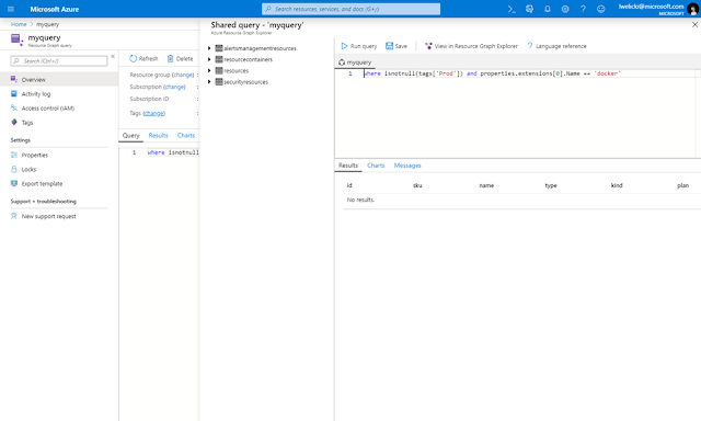
We have now introduced Azure Resource Graph Queries in the Azure portal as a new top-level resource. Basically, you can save any Kusto Query Language (KQL) query as a resource in your Azure subscription. Like any other resource you can share it with colleagues, set permissions, check activity logs, and tag it.
Figure 10 – Azure Graph Queries
Automatic refresh in Azure Dashboards
We have added automatic refresh to our Azure dashboards, allowing to automatically refresh your dashboards over several time intervals.
Figure 11 – Configuring automatic refresh
Improved service icons
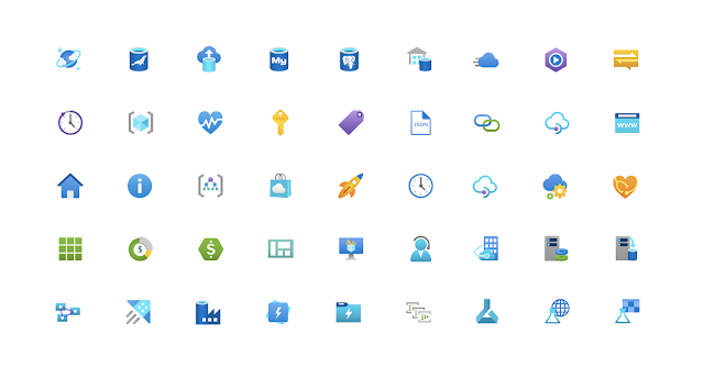
We've updated all of the service icons in the Azure portal with a more consistent and modern look. All these icons have been designed together as a family to provide better visual consistency and reduce distractions.
Figure 12– Improved icons
Simplified settings panel
The settings panel has been simplified. The main reason for this change is that many customers could not find the “Language & region” settings in the previous design and were asking us for capabilities that were already available in the portal. This new design separates the general and the Language & region settings, the portal supports 18 languages and dozens of regional formats, which was a common source of confusion for many of our users.
Figure 13 – separation of general and localization settings
New landing page for Azure Mobile application
The Azure mobile app enables you to stay connected, informed, and in control of your Azure assets while on the go. The app is available for iOS and Android devices.
We have added a brand-new landing screen to the Azure Mobile App that brings all important information together as soon as you open the application. The new Home experience is composed of multiple cards with support for:
◉ Azure services
◉ Recent resources
◉ Latest alerts
◉ Service Health
◉ Resource groups
◉ Favorites
The home view is fully customizable, you can decide what sections to show and in which order to show them.
Figure 14 – new home in the Azure Mobile App
If you have not tried the Azure Mobile app yet, make sure to try it out.


0 comments:
Post a Comment