A few months ago, we posted a survey to gather feedback on your experience with metrics in Azure Portal. Thank you for participation and for providing valuable suggestions!
We want to share some of the insights we gained from the survey and highlight some of the features that we delivered based on your feedback. These features include:
◉ Resource picker that supports multi-resource scoping.
◉ Splitting by dimension allows limiting the number of time series and specifying sort order.
◉ Charts can show a large number of datapoints.
◉ Improved chart legends.
One of the key pieces of feedback we heard was about the resource picker panel. You said that being able to select only one resource at a time when choosing a scope is too limiting. Now you can select multiple resources across resource groups in a subscription.
We want to share some of the insights we gained from the survey and highlight some of the features that we delivered based on your feedback. These features include:
◉ Resource picker that supports multi-resource scoping.
◉ Splitting by dimension allows limiting the number of time series and specifying sort order.
◉ Charts can show a large number of datapoints.
◉ Improved chart legends.
Resource picker with multi-resource scoping
One of the key pieces of feedback we heard was about the resource picker panel. You said that being able to select only one resource at a time when choosing a scope is too limiting. Now you can select multiple resources across resource groups in a subscription.
Ability to limit the number of timeseries and change sort order when splitting by dimension
Many of you asked for the ability to configure the sort order based on dimension values, and for control over the maximum number of timeseries shown on the chart. Those who asked explained that for some metrics, including available memory and remaining disk space, they want to see the timeseries with smallest values, while for other metrics, including CPU utilization or count of failures, showing the timeseries with highest values make more sense. To address your feedback, we expanded the dimension splitter selector with Sort order and Limit count inputs.
Charts that show a large number of datapoints
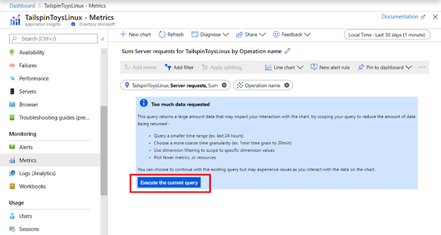
Charts with multiple timeseries over the long period, especially with short time grain are based on queries that return lots of datapoints. Unfortunately, processing too many datapoints may slow down chart interactions. To ensure the best performance, we used to apply a hard limit on the number of datapoints per chart, prompting users to lower the time range or to increase the time grain when the query returns too much data.
Some of you found the old experience frustrating. You said that occasionally you might want to plot charts with lots of datapoints, regardless of performance. Based on your suggestions, we changed the way we handle the limit. Instead of blocking chart rendering, we now display a message that suggests that the metrics query will return a lot of data, but will let you proceed anyways (with a friendly reminder that you might need to wait longer for the chart to display).
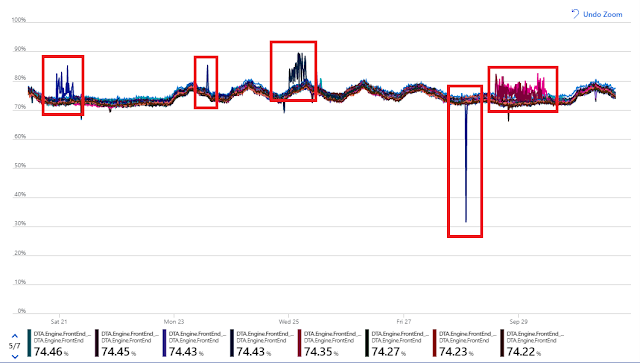
High-density charts from lots of datapoints can be useful to visualize the outliers, as shown in this example:
Improved chart legend
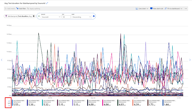
A small but useful improvement was made based on your feedback that the chart legends often wouldn’t fit on the chart, making it hard to interpret the data. This was almost always happening with the charts pinned to dashboards and rendered in the tight space of dashboard tiles, or on screens that have a smaller resolution. To solve the problem, we now let you scroll the legend until you find the data you need:
Feedback
Let us know how we're doing and what more you'd like to see. Please stay tuned for more information on these and other new features in the coming months. We are continuously addressing pain points and making improvements based on your input.
If you have any questions or comments before our next survey, please use the feedback button on the Metrics blade. Don’t feel shy about giving us a shout out if you like a new feature or are excited about the direction we’re headed. Smiles are just as important in influencing our plans as frowns.


0 comments:
Post a Comment